The site can look done and still not sell.
Agencies ship atmosphere: type, motion, a case-study mosaic that feels expensive. Sales still copy-pastes a PDF because the live page cannot carry an offer, a next step, and a record of who asked.
That gap is not a taste problem. It is an operations problem. The website is the first employee of the revenue system. If it cannot brief the next human — or the CRM — it is unemployed décor.
If you cannot name the owner of a form submission, you do not have a website. You have a brochure with a loading animation.
We design for the path after the click: where the lead sits, what sales sees, which event proves the page did its job. Aesthetics stay. They just stop being the brief.
Pretty is cheap. Handoffs are the product.
A “Contact” button that emails a shared inbox is how deals go dark. The sales-ops version writes the source, the page, and the offer into the record, then routes it to a named queue with a response SLA.
Same for calendars, WhatsApp, and chat. If those surfaces do not create the same object in the CRM, you will argue about “lead quality” while the leak is structural.
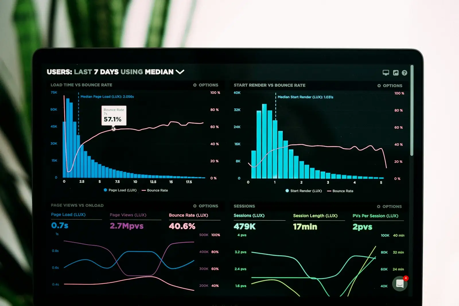
Measurement follows the same rule. Scroll depth and bounce are weather. Form-to-record, call connected, meeting booked — those are jobs. Tag the jobs. Kill the fireworks.
Change the brief this quarter.
Do not start with a redesign. Start with a desk review: offer, handoff, measure, close. Fix the missing job on the pages that already get traffic. Then, and only then, talk about a new visual system.
If you are about to buy more media, pause. A sales-ops site makes spend safer because the destination can hold the click. A moodboard site turns budget into a screenshot.
Related on this site: Web Design for the interface, UI/UX for the flow, CRM Development for the handoff. The note is the operating principle those services share.